Pre-Production: Testing Color Correction
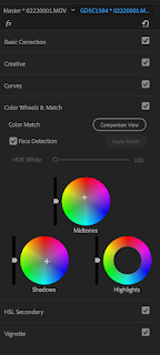
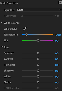
The color of the show will place emphasis on the color orange. I want the colors to have dark shades of blue or teal, against the bright orange tones that will come across from the skin. I prefer to use the curves adjustment layer in order to give me more control over what I am doing and if it goes wrong I can just delete the layer. Having experimented with these colors in test shoot edits, I have found they look very impressive and enhance the cinematic image aesthetic significantly.
This grading technique uses a combination of adjustment layers; Hue/Saturation, Curves, Levels and Solid Color Fill. Depending on the look I want to achieve for each of the scenes, this process can be altered and switched to fit that. Whilst I don’t want this to be too overpowering and not look naturalistic, color grading videos will completely change the images.
Before color grading:
After color grading:
After color grading this clip I have found that the cinematic look really does work for our documentary style, and is achievable in the filming and edit. If I shoot cinematic like I did for our test shoot, that combined with the editing and color grading should be really effective overall. I want to explore further how I can apply this to all scenes in the documentary because it won't always look right having this orange tone.

 During sad moments the saturation and vibrancy of the show will need to be decreased. So the audience gets a sense of the sad emotions the characters are feeling, and it differs to the look of the rest of the show. This will create a different tone, to show the audience that there is a different emotion being presented. For moments of passion, the tone will be more orange. 4
For a cold, dramatic image...
Create a Hue/Saturation Adjustment Layer. Drag the Saturation slide far left to around -40, nearly halfway to black and white. The de-saturation will add drama to the image.
Create a Curves Adjustment Layer. With this adjustment, it's all about the subtle color. Pull down the mid tones in the Red, Green and Blue channels to achieve a moody blue/green tinted image.
Create a Levels Adjustment Layer. Drop down to the blue channel and drag the bottom black slider to the right to bring blue into the shadows. Then, drag the white slider just slightly left to bring back warmth in the highlights.
For a natural earthy, warm image...
Create a Hue/Saturation Adjustment Layer. Drag the Saturation slider left to around -15, for some slight drama.
Create a Curves Adjustment Layer. Pull up the highlights on the Red channel. Then, drop down to the Green channel, pull up the highlights and pull down the shadows to create contrast. Drop down to the Blue channel, again create a small "S-Curve," pull up the highlights and pull down the shadows.
Create a Levels Adjustment Layer. Drop down to the blue channel and drag the bottom black slider to the right to bring blue into the shadows. Then, drag the white slider left quite a bit to bring back a lot of warmth in the highlights.
Create a Solid Color Fill. From the color, picker selects a strong gold/brown, but not too dark. Change the blending mode to Hard Light, then bring down the Opacity to around 8%. This will give an additional hazy warmth to the image. (Helpx.adobe.com, 2018).

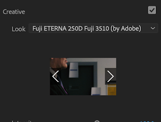
One thing I have learned from Peter Jackson and the way he edited the Great War footage, it is to not rush color grading. In my color grading tests, I have found that I can be more precise in my coloring and rather than just choosing a filter on premier pro, I can take it to the next level with software like Devinchi. For the final project, I have decided to advance color grading further by teaching myself and using this software to grade specifically to the color I want. This is what they would do for films and is something I should definitely consider. Being more specific in grading means it is better adaptable for lighting conditions which always inevitably change when shooting different scenes. "When it comes to video editing, color grading can be one of the most challenging elements. The reason is that lighting conditions change and it’s often hard to know what all the colors and shading will look like throughout a film."(FilterGrade, 2018)
References:
FilterGrade. (2018). Free Cinematic LUTs Pack for Video Editing - FilterGrade. [online] Available at: https://filtergrade.com/free-cinematic-luts-video-editing/ [Accessed 7 Dec. 2018].
Helpx.adobe.com. (2018). Using Color Correction effects in After Effects. [online] Available at: https://helpx.adobe.com/uk/after-effects/using/color-correction-effects.html [Accessed 7 Dec. 2018].


Comments
Post a Comment