Major Project: Editing Graphics

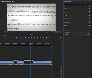
In order to make the medical report more engaging and video-like I wanted to have it move and also create a shaddow on it. Whilst it was jsut a still iage, this keepis it fititng with not only the rest of the documentary but also the Netflix style. Netflix usually highlight the important text with documents in order to stand out for the viewer. In this I will also be highlighting any key pieces of information displayed by either highlighting wiht color or keeping the important text in focus and blurring out the useless information.
Something that has inspired my graphics greatly was one of my inspired documentaries 'The dissapearence of Madaline Maccan'. In this they use clever graphics when discussing all the tweets that were posted on twitter and in doing so they are all floating around like they are all still deep in the web, in this social media world. I found this intreaguing and feel it fits really well with the tone of our documentary. I have been struggling for ideas on how to display the text messages that were recovered at the last minute of the 11th hour in Liams trial clearing his name. In using this effect in our own documentary it would symbolise how all the texts were lost in this digital space of thousands of texts but these ones popped up when searching 'key terms'.
A video which helped me work out how to design the text message was 'Cinicom.net':

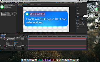
The first stage was to create a message bubble in after effects. This was achived using a rounded rectangle and adding a four-point color fill which allowed the text to have depth and look less flat and more realistic to text messages you may see on devices like iphones.
I then downloaded the iMessage logo from google and imported it into the file. This was then positioned to the top left of screen notification. I then added three layers of text.
One said 'MESSAGES' the other 'NOW' indicating the time and also the text message itself released to the public. I recreated this several times over with all the released texts. in new compositions. I then attempted the background which I jsut wanted to keep a plain white. I blurred the other messgaes and had them slowly move up whilst the text in focus stayed at the fore-front. This was semi-effective but I felt it could be better. The final result is in the video below:
When comparing to the graphic in the Madaline maccan Documentary I felt it wasn't up to the professional standard and could do with a lot more modification. I looked up some futher tutorials in achieving the computer screen look in After Effects.
I set off to create a new backgroudn to start a fresh. I was happy enough with the texts I designed so I kept them and added loads of different variations into the space of different sizes to create the feel of depth. I made sure to make all the texts a 3D layer by checking the 3Dcube box next to each individual one on the timeline.
 I then went onto layer/new/null object. I then selected the3D box on that too. I then went onto layer/new/camera and this allowed me to add a 3d camera. I dragged the lasoo tool from the camera to the null object to attach itself to the null so any adjustments made to that the camera will follow. I adjusted the position which allowed it to zoom in past all the other texts to highligt one. I could then add keyframes and play around in order to jump from text to text creating the illusion that they are all lost in this digital world. I then right clicked on each of the keyfrsames and selected 'easy ease' to make the transitions more fluid.
Once this was complete the movement behind the graphic was. I could have left it there. However, I wanted to really go the extra mile and make this seem as real as possible. If anything in the documentary looks too artificial it will give the impression that the stroy is dramatised or simply disingenuine. So researched and found a tutorial which shows step-by-step how to make it look like a computer screen and the stages are described in the following video:

Online Tutorial:
Mine in Practice:


Comments
Post a Comment